-
Posts
5 -
Joined
-
Last visited
Everything posted by vovan666
-
Yeah, because video game visuals totally differ from any other type of visual art and obey totally different rules (they don't, btw).
-
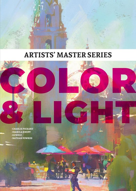
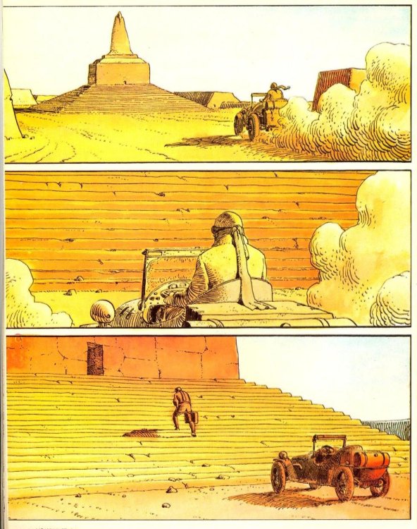
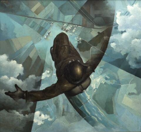
You got me there! My opinions about the matter are based mostly on the info I picked up from these books:
-
'This thing is good, because it's good, but this exactly same thing is bad because I said so, even if there's no difference between the two' Okay, then. I'll just give some examples, mostly from the games that have already been mentioned in this thread. FO3's and Skyrim's visuals were carefully curated to emulate the look of Adam Adamowicz's art, as noted before me. The green/brown palette reflects the ecological catastrophe, tint changes based on your location to enhance the visual language (red in Pitt to reflect the glow and heat of steelworks, blue in Ancorage to make the thing feel colder, etc.) RE5's color correction is the way it is as a homage to Black Hawk Down, changing between the levels from yellow to green to red. Far Cry 2 tries the same, conveying visuals similar to The Blood Diamond and looks like plastic garbage instead of dusty savannah with its filters off. Far Cry 3, on the other hand, uses its postprocessing to enhance the green jungle and blue ocean, making the image more saturated than it really is, thus, achieving the feel of 'tropical paradise'. Payday looks like that because it emulates Heat. Terminator Resistance and Aliens: Colonial marines occasionally use blue filters to make their visuals closer to James Cameron's movies. San Andreas uses filters to look like certain mid-90s hip-hop music videos and Menace 2 Society, also changing its color grading based on the location, thus providing different feel and atmosphere to different regions. Alien: Isolation and CP'77 use chromatic aberration to maintain a certain 'retro' look and feel, which is directly connected to their retrofuturistic art-direction. The Trine series has always used heavy post-processing and LUTs to make their environments more bright and vibrant, but still easy on the eyes, sometimes reducing them to soft pastels, and sometimes making them high-contrast within the same level, based on the scene, and those are some of the most gorgeous games out there. And, finally, The Gothic Remake uses desaturated colors the same way desaturated colors are used in, say, Children of Men. The list goes on and on. You're just either too stupid and parrot something you've heard from a random guy on YouTube, outright blind, or just hate videogames and are extremely biased against them.
-
I'd add that 'visual clarity' and 'natural colors' haven't been seen as definitive and 'objective' qualities of a good visual art piece since the 1870s. A truly good artist always experiments with the palette, thus enhancing the mood and atmosphere of his work, even if we're talking about the realm of realism. Gothic 1, on the other hand, goes for a slightly different thing, which still benefits of certain post-processing, albeit in a different way: through making it closer to so-called 'dirty realism'. As a game has always been an example of low fantasy, that leans into the 'dark' subgenre, it's set in a literal penal colony, a ridiculously hostile place that treats the main character in quite a rough manner. Of course, making it all grey and desaturated would enhance the atmosphere, thus giving everything that happens an even more moody and unfriendly vibe. That's, like, visual storytelling 101. And, of course, making it all muddy and shitty enhances it even further, as that's precisely what it was trying to do in the first place with limited early 2000s technology. You don't expect vibrant colors from Tarkovsky's Nostalgia or Perfume: The Story of a Murderer. In this concrete case, desaturated visuals help convey a certain tone, which perfectly corresponds to everything that's happening on the screen, and you have to be blind and deaf to say it's not.
-
God, you guys are such philistines. Color grading has been a thing in movies for over a century now, and I dare you to say any of those films look worse because of it. If anything, people remember those, among other things, because of their visuals. From Cabinet of Dr. Caligari to basically anything made by Wes Anderson, the visual language of cinematography has always been deeply intertwined with the creative use of color (unless you're one of those people who consider schlock like Deadpool vs. Wolverine to be good-looking in any way, that is). And if you consider games to be any worse than that, then I have some bad news for you: videogames are a visual medium too.


