
FullBusinessSuit
-
Posts
88 -
Joined
-
Last visited
Everything posted by FullBusinessSuit
-

Contest to win a GOG copy of Iron Harvest
FullBusinessSuit replied to Ross Scott's topic in General News
My macbook pro 2011 still looks like this; I never update the OS if I can help it. They tricked me once into updating because my VPN program said it would work, but it didn't and they wanted me to update again or update to an OS that apple wouldn't allow on my macbook. I forget which. Anyways, I was also thinking about this interface when I mentioned that "stock look" to one of the chosen GUI skins. I have a somewhat updated ipad & iphone though (I also have never updated it, unless forced), and the flat design just doesn't fit. They should just go back to the old way. Even my android phones have all the flat UI stuff with gestures. I don't like it - I prefer gingerbread and older (G)UIs myself. I always thought the reflection was a little much, even distracting. I was always wondering how much extra CPU/GPU overhead that was taking up, too, since I always had a bit of lag with that laptop. The "genie" minimizing animation made me think of that too, but I thought that was a nice effect; as opposed to the scaling effect. I liked having a quick way to have a chance at remembering right where the program was in the dock. On physicality, this was the expressed purpose of "material design" when google launched it in 2014, but clearly they chose "let's make everything flat and eliminate long presses and other good idea in favor of gestures because objects move and now you can move list items" (gestures suck in comparison to some of the old ways, like long pressing to right click). But apple did get material design right *the very first time* with iOS. But that's all gone now, and it's worth avoiding apple https://files.catbox.moe/hdmdvk.png
-
Contest to win a GOG copy of Iron Harvest
FullBusinessSuit replied to Ross Scott's topic in General News
I'm on W7, and I have gradients, and I never changed the stock skin https://pasteboard.co/JrhR5Ac.png Are you referring to W10 because I'm still resisting There is a very specific place this started: Google with "Material Design" debuting at Google IO 2014. It completely failed at what "material design" means in computer science (which means "objects" on the screen are supposed to mimic real life objects) with respect to UI/UX development, and the only reason it persisted was because of a very large number of normies graduating from universities' CS departments whom only entered the field to get a job/be trendy, and it goes without saying these people were without direction, and so they simply copied what they thought the next trend would be; they went all-in on material design. I can still hear these people in my mind with their contrived happiness - no no - euphoria about material design now. Google also adopted the flat art style in pictures and logos to cheap out on graphics costs. I do like my essential productivity tools no-frills though. I was trying to dig up a source for what google was saying when they first released it, where they were talking about the old CS design concept of mimicking real life objects, but I cannot find something like it, and everything I saw in my search results is saying material design always intended to look flat; and everything is just describing material design exactly as it is now - which was definitely not how it was pitched, as I recall the entire office I was working at talking about it. Oh well. -
Contest to win a GOG copy of Iron Harvest
FullBusinessSuit replied to Ross Scott's topic in General News
This looks like something stock windows already offers in terms of color. I think the last time I fired up Windows Media Player was 2007, and I think this is a theme one can choose for that app too; or something very similar. Maybe except for the hard to read font. I know this one got picked, but it even seems kind of bland. I'd lean towards something unconventional so I get that excited feeling whenever I go to use my computer. :-/ -
https://web.archive.org/web/https://torrentfreak.com/archivists-want-broader-dmca-exemption-for-abandoned-online-games-200910/
-
Contest to win a GOG copy of Iron Harvest
FullBusinessSuit replied to Ross Scott's topic in General News
I love this post, do you care if I save it?
-
Contest to win a GOG copy of Iron Harvest
FullBusinessSuit replied to Ross Scott's topic in General News
I have a bunch I found that I think are cool, but here's my main pick Old_Timey.wsz An interesting bit behind what I was looking for here: I always thought the interface for the Sega game "Soldier of Fortune" looked pretty cool (the game's got a mystic vibe about it mixed with mercenaries and military dudes, including a scientist with questionable character; not that that's a bad thing), so I went to find something that had a more military style, and there were a bunch that looked good (and they did have the Soldier of Fortune skin as well). I picked the one that I wanted that closest matched Ross's criteria from the GUI video. This is a darker theme (that part is kind of my preference) - but not too dark in case you go to look at a bright picture or something, since it has those lustery spots and plenty of room to add lighter shades. I have a runner-up theme that might match that criteria better, but I didn't know how dark Ross would allow, however I still picked this one for the contest because it matches Ross's computer theme where he's got his surface and core drives, and this sparked my imagination of taking a submarine to the bottom of the ocean to take a gate into the core of the planet. Or even a similar machine to withstand pressure drilling into the surface of the planet. I LOVE IRON HARVEST!! SAXONY FTW! Favorite line from the game: "What does the empire require?" Gives me goosebumps knowing the Third Reich is coming. -
Obvious question: It looks like you can change out the buttons for bigger ones at the expense of space, of course. So why don't you buy the Roccat Nyth?
-
Not sure if you think thins mouse is wireless; it's a wired mouse. It would be my dream mouse if it was optionally wired and wireless with a micro usb plug in (as long at there's no response-time sacrifice). Never. I truly don't recall a single time where I accidentally hit the buttons on the side; there is ample room below the buttons to comfortably rest my thumb, and grip the mouse if need be; to be more specific, my thumb sits just in front of the front keys (G9, G10, and G11). This mouse is different from the one that Ross mentioned in the video btw. I think logitech's goal was "no frills" with this gaming mouse. I bought this mouse instead of those fancy colorful ones because it looked like logitech took itself more seriously. Anyways, the closest I've came to accidentally hitting a button is me pressing the wrong button when I'm trying to do something too fast. But Ross is a mutant, and maybe he holds his mouse weird, idk. I have the mouse I have because it has maximum programmable buttons. The G502 says it only has 11 programmable buttons, and I'd feel like that's a downgrade. I really, really like all my buttons. That being said, I'm not sure just how ergonomic the spread out button concept is - it could work, I'm simply not familiar with it. My guess is though that it doesn't allow you to hold your mouse properly when trying to reach for the buttons. I know Ross wanted to use all his fingers, but aside from a single button on the other side for my pinky to cycle through desktops I'm not sure I want any buttons on that side; mainly for holding my mouse in place, and if that solid surface wasn't there THEN I might be accidentally hitting some buttons. Again, it's something that could work, but like Ross, I can't have everything I want in a mouse either. I have called up Logitech many times and suggested that they expand upon the G600 with different shapes and some more buttons. The G502 looks ok if you don't want all the buttons. I kinda covered this above, but I have never had problems with the weight of any mouse, so that might be something you have to try for yourself; it's simply never come into play for me. However, I will say that the mouse is very smooth along my table, and it's accurate. I mentioned the grip above as well, but I can expand a little by saying there's a bump surface where my pinky rests, which does help with grip, and where my thumb sits the surface is contoured just enough to allow one to "get under" the mouse a bit to assist in picking it up. Also, when I hit the G button with my ring finger it has a groove that fits my ring finger in it, and I can squeeze the mouse the little bit needed for when my thumb is reaching for the side keys closest to my wrist (G18, G19 and G20). The buttons do not add extra bulk as they're recessed into the mouse a bit; if one looks at it from the bottom only a portion of the G9 key sticks out. I also just noticed that when I hit the left and right buttons for the scroll wheel that I use my pinky, yet again, to hold the mouse in place. That being said, Ross should know that if you have to move your pinky off a button to the side just to hit that right scroll wheel button you're probably going to lose some speed, and - I'm telling you, I'm fast with this mouse. I'm constantly popping between windows, tabs, copying, pasting, accessing my menu bar, desktop, backspacing, deleting, hitting enter, refreshing pages, and all the other buttons. You want that speed, like you said in your video.
-
Here are the pics that are supposed to be in my previous post; the links that this website generated are broken from what I see, and I cannot edit the post. https://files.catbox.moe/5jkx4f.PNG
-
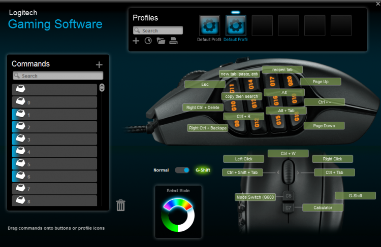
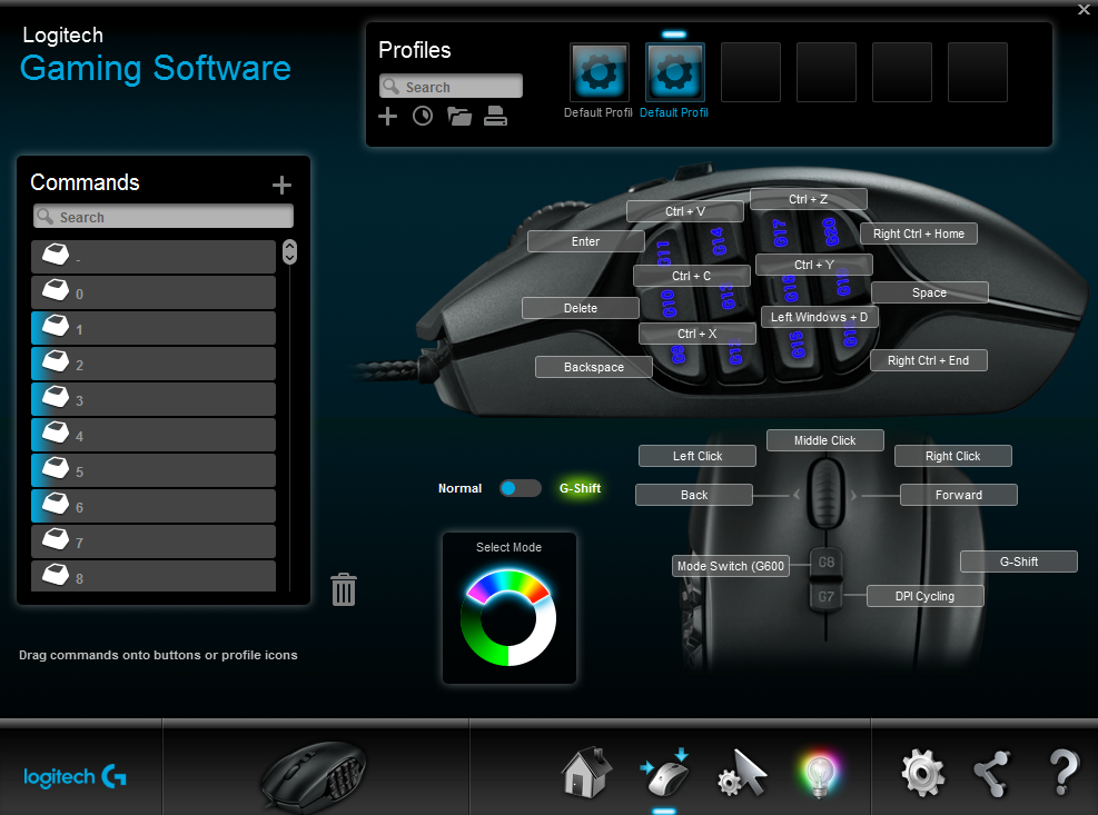
My idea doesn't fit Ross's request (although I think my set up is worth considering, Ross, as I've been using this set up for over ten years, and I've tuned it well for memorization purposes that you mention in your video). I originally posted this in the discord channel, and I don't want to go through and edit anything, so here's the copied and pasted version: I can explain the key layout and why it works for anyone else interested. First: my methodology. I wanted the mouse to have commonly used keystrokes, and I wanted the secondary commands to line up as closely with the first layer of commands so that if I forget what I programmed these buttons as I could think about what the first layer (which is used most commonly) was and remember what it was. Also, you'll notice i'm using some seemingly circuitous button combinations for common functions, and that's because other OSes have the same commands as what I have here, so if I plug my mouse into another computer I have a chance that MOST things are still working. Second: the first layer of buttons. This is more intimidating than it looks. These are all one or two button presses on the keyboard. Enter, delete and backspace are button i use the most commonly so I put them in the most convenient thumb pressing locations. these buttons are grouped here as well because they are related in that I can make a newline or get rid of a line, and I can do it in front of the new line character or behind it. enter also is handy for all instances where you want to press enter other than a newline, which is a lot. Cut copy and paste are in such and order that I can run my finger up the keys until I recite in my mind "cut copy paste" and I remember which is which. and if i start using them in rapid succession i know exactly which key to press, and this saves me from having to lean forward in my chair quite a bit. this is what you want undo and redo seem natural in these two locations, i can't explain it. and I grouped them next to each other for memorization purposes. windows+d is here because it's kind of a loaner function that needed a single slot and there isn't a third function that goes with undo and redo. it works very well here. the back column here I use quite a bit. it lets me jump to the top or bottom of a page, and I put them at the top and bottom of the column for intuitive purposes, i.e. "go to top" "go to bottom". and space is here because i often need to add a space between something or several spaces if I'm writing code. it can also be used to navigate down web pages, and play and pause videos, which I do A LOT i left the left and right scroll clicks as back and forward because that's very handy, and it matches all other mice functions in case i switch mice (it sucks going from god-tier mouse to plebeian mouse). DPI cycling is what you think it is. mode shift is to switch profiles on the mouse, which I have. Third: the second layer of buttons: the second layer of these buttons is meant to match the first layer's function as closely as possible the first column has: backspace an entire word or delete an entire word. I have played around with having enter be "shift enter" instead of ESC, however this resulted in many messages being sent prematurely and so I made it ESC instead, and I can remember this because if I rotate the mouse counterclockwise towards me the button is in the upper left of the mouse, just like the ESC key on the keyboard (i sometimes move ESC around and this is where human memory can start to fail) column 2 i use ALL THE TIME, especially ctrl+r (refresh). the middle button will allow me take highlighted text, copy it, open a new tab, paste it and press enter to search (again, i use this several times per day). the top key is if I already have something on the clipboard and I have my browser active i can, with my mouse anywhere on the screen press that button and it opens a tab, pastes and presses enter. column 3: reopen tab gets used all the time. alt is to show waterfox's menu bar, and alt tab is to go back to the last window i was using (i want this to actually do a alt+tab then hold tab so i can press tab to choose a program or click one from the pop up, but i haven't figured out how to easily do that yet). column 4 let's me page up, page down and shrink what's on the screen. the secondary function for the middle click is going to be Ross's favorite. I CAN CLOSE A TAB WITH MY MOUSE ANYWHERE ON THE SCREEN INSTANTLY!! then the right and left scroll clicks are for navigating tabs in the web browser and then there's the calculator in case i want to open that, which i do all the time. This post is getting long, and I'm running out of time. I'll add more if anyone cares.