


emscape
-
Posts
1 -
Joined
-
Last visited
-
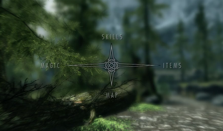
Thank you ross for the amazing video. It has long been a pet project of mine to try to overhaul the Windows GUI. In Windows 7 it was possible to straight up edit the icons in the dll's of Windows. How to rethink GUI? I think it would be a lot easyer if we use similar ordering structures when starting applications to when accessing running applications so it is easy to get into the flow of things. This can be done by seperating programs based on their primary purpose. A possible separation could be: Display data entry modification configuration After pressing a button (or combo) the user should easily (and quickly) be able to flow into the selection of the application to be started / selected. I would do this by grouping these in quadrants of the screen (like the start of Skyrims inventory/spells/level screen shown below, but without the wait). After doing this a user should be able to quickly hover trough the options. Instead of making single-clicking the primary mode of interaction, hovering above items should make them more descriptive. I think it should be visualised like an expanding node network if it get's complex (for example when many programs are installed). I think we also should rethink the way we alt-tab using a similar configuration. Also, I like the multiple desktop configurations idea macOs and Linux have been implementing, but with one major addition to make it work. You'll have multiple desktops with different program subsets for different kinds of workload.


This website uses cookies, as do most websites since the 90s. By using this site, you consent to cookies. We have to say this or we get in trouble. Learn more.