


Isaiah
-
Posts
159 -
Joined
-
Last visited
Everything posted by Isaiah
-
@Ross Scott Regarding crackwatch being inaccurate: A "cracked" game is not necessarily fully or even partial playable. This is because there can be multiple parts that need to be cracked to make it actually run. The first "crack" is often just extracting the encrypted game files to gain access to them. But that step alone doesn't mean the game itself is now playable, etc. For Darkspore they just got a basic server emulator working (Resurrection Capsule) which allows you to get in-game, but you can't actually play the game... yet. So the game is technically "cracked", just not completely. It would probably be very helpful if crackwatch also listed the playable state of the games as well ( Just like emulator sites often do) to make their actual status more clear.
-
@Ross Scott FYI: those were twitter quotes from @gravislizard and not his own thoughts.
-
No. I reread our previous comments and realized I did a very bad job at explaining the exact contradictions I was seeing and this created confusion and frustration for both of us. So let me try to explain in more detail some of these. You claimed my Start Menu suggestion was inefficient compared to your context menu method because: 1. I have to travel down to the bottom left of the screen each time This claim directly contradicts your own video where you actually demonstrated just how fast and reliable moving your cursor to the bottom corner of the screen is. You also already move your cursor there all the time for common shortcuts and even admitted that you move your cursor to the dock to open the context menu when there is no exposed desktop anyway. Making this complaint even less valid. 2. I have to click twice as opposed to once Not if everything is in the main folder and I don't see how an extra click is less efficient but that's more a personal issue/preference in any case. 3. Even when clicking once, I have a higher travel time to the folder in ADDITION to the travel time to the start menu Again, the extra travel time complaint contradicts everything I pointed out with claim #1 above. You can also use the scroll wheel to rapidly scroll through the start menu without moving the mouse and I'm not sure you can even do that with your own context menu method. 4. I can't fit as many programs in the same amount of space This directly contradicts your claim in the video about small elements being inefficient. You can't have it both ways because making elements bigger so they're easier to click will naturally make them take up more space and require more "travel time", but it also means you can move through them faster since it requires less accuracy, which I thought was the whole point? I also pointed out that Fitts's Law demonstrates that big+far (start menu) is about as efficient as small+near (context menu). So they kind of cancel each other out and makes the extra travel complaint irrelevant anyway. And the Start Menu being located in the corner of the screen gives it an advantage over your context menu and better aligns with your very own "runway" concept that you think everything should follow. Which is another kind of contradiction. Now I totally failed to properly explain all this in my previous comments and gave you the impression I was claiming the contradiction was solely between travel distance to small targets and travel distance of mouse gestures. But the mouse gestures point was really just meant as an additional example of why claiming more "travel time" equals less efficiency contradict with your own efficiency solutions. But you did make a very good point about gestures not being directly comparable because they require less accuracy. So I'll give you that. However, even if we exude gestures altogether here that doesn't actually invalidate the contractions pointed out above because it's not even related to them. And this is also why I said your explanation about mouse gestures and transcending Fitts's law was unrelated to my actual issues. My issues here are also not just related to contradictory complaints but also ones that just don't make any sense. For example, even though you admitted you "forgot" about the ability to hide desktop shortcuts, you made some bizarre complaints about it in the process. Increases travel distance compared to what? It's a context menu so you just right-click anywhere on the desktop and "boom, boom, boom" there the menu is! This complaint is not only contradictory to the start menu complaints but also nonsensical. And on top of all this, you only have to toggle this option ONCE when you install Windows and never touch it it again. Making all these complaints just silly. Now I'm sure you will dispute all these points and that's fine. I'm really not trying to convenience you here that my criticisms are valid because I realize now that's a waste of time. I really just wanted to try and better explain why I feel this way since you seem to think I'm just making up accusations. Regarding the alt+tab example Already explained that alt+tab shows names and big thumbnails. So it's an objectively faster way to both identify and select tasks visually over just text and small meaninglessly icons. Nope. I find this to be just another contradiction - flooding screen with more info about tasks overwhelming and bad, but flooding screen with more info about many, many more files even better? Okay. I still see many contradictions here and disagree with most of your proposed "inefficiencies". At least from an objective standpoint. However, I know none of this is intentional and by "efficiency" I think you really mean just doing things the way you like. Which is totally fine but I wish I had realized this before trying to help because it would have saved us both a lot of wasted energy and frustration.
-
I already gave specific examples but I never wanted to get into an argument or upset you so much either. I was Just trying to point out what I thought were some issues with your complaints but that was obviously a huge mistake on my part. So let's just move on. You're misreading my comment completely. I'm talking about the effort to actually create the ultimate GUI itself. Not the effort you put into making the video. Most of the "truth" and "proof" presented in the video is also debatable because of it's subjective or vague nature. So they're not as definitive as you think. In any case, my efforts to help here seem to have all been in vain so I'll try to restrain from giving any further feedback. But I do sincerely hope you find some kind of solution. The real shame though is that your further comments on what you actually want had inspired me to think of an exciting new gui concept that I was planning to work on. But the fact I have upset you so much now has really demotivated me from even getting started on it because I fear it will just be another waste of time
-
This helps me understand your actual objectives a lot better but it's also completely unrelated to the issues I was trying to point out. Think I understand the reason for these seeming contradictions and inconsistencies now. It's due to the fact you're mixing up two entirely different issues: Loosing your current workflow when upgrading from Windows 7 to 10. Developing the most efficient GUI possible, regardless of OS. All my suggested solutions were solely aimed at helping you migrate to Windows 10 with as little change to your CURRENT workflow as possible. They had nothing to do with your IDEAL dream GUI that doesn't exist yet. That's an entirely different subject. However, when I pointed out a feature of Windows 10 that works exactly like, or very similar to, your CURRENT setup, you either dismissed it as not IDEAL or bragged that you've already had that feature long before Windows did. All of which is beside the point and makes it seem like you just have a personal vendetta with Microsoft (no big surprise, ha!). Your latest response mixes these two issues together even more, which makes it feel pretty incoherent. And all of this makes trying to help you solve the issues you have RIGHT NOW very frustrating because the goalpost keeps switching. Now I know you're not doing any of this on purpose, but that's exactly why I'm trying to make you aware of it! Because I really am trying to help you. The problem here is that you're actually putting the burden of finding GUI "enlightenment" on the shoulders of everyone except yourself. The video could be summarized as "This all sucks and could be way better but I'm not an expert so I want you to show me how to fix it". No offense but this is the easiest criticism anyone can make about literally anything because it doesn't require any real proof or effort from the person making it. So it's not surprising at all to have people ask for some kind of tangible course of action since you're making such a bold claim.
-
I'm sorry but you don't seem to understand the formula or what I was saying. My whole point was that they are at best equally efficient according to Fitts's law, and your diagram only confirms that. However, Ross has claimed both ways are worse in difference situations, which is a contraction. Now I'm not claiming this was intentional deception and I may be wrong about the reason behind it, but none of this changes the fact the two criticisms are not only contradictory but untrue according to Fitts's law. At least in the way he presented them.
-
My issue here is not with the ideas themselves as much as Ross' contradictory positions pertaining to these ideas when criticizing the Windows GUI. Which gives me the strong impression he's really just looking to validate existing Microsoft prejudices without attempting any kind of objective analysis here (e.g. desktop icons). For example, he complained in the video about most Windows GUI elements being too small, but here he complains that the new Windows 10 GUI elements are too big. The former because they require too much precision and are therefore inefficient, the latter because they require extra travel distance and are therefore inefficient. Now from what I understand, Fitts's law demonstrates that the relationship between size AND travel distance is what determines efficiency. So calming size OR travel distance alone is a sign of efficiency is wrong. Ironically in the case of Windows 10, Ross complained that the elements where both too big and too far away, but according to Fitts's law such a combination is actually just as efficient or more efficient than smaller and closer elements. And being near the edge of the screen only improves things. But doesn't this also mean that the default Windows taskbar and start menu are "infinitely" tall and are therefore more or equally efficient to Ross' custom anywhere menu? Also, the distance to the element is an important factor and like I said before, the cursor is more likely to be closer to the center of the screen than the edges. So it seems you could argue that the dock/taskbar and alt-tab screen are efficient in different ways. Also, the biggest advantage I was trying to highlight with alt-tab vs dock method was the fact you can see all open apps at the same time without even moving the cursor.
-
In your video you complained about small GUI elements that demand too much precision from the user and recommended a "runway" approach, reasoning that "the less precise you need to be the faster you our". Okay, fair enough. But here in the forums you complain about increased travel distances being inefficient, which your very own "runway" concept would actually produce. The very mouse gestures you love being the perfect example of that. But for the sake of argument let's assume for a moment that greater travel distances are less efficient. Well with the alt-tab method I mentioned you instantly see all open app names at once with very helpful preview images, which is an objectively faster way to identify them than your method of moving the cursor all the way down to the bottom of the screen and across each icon to see the name of each, one at a time. And there displayed in the center of the screen closer to where the cursor most likely already is. And finally you only have to move your cursor to the exact app you want once identified. Meaning the alt-tab method is faster either way because it requires less travel distance and precision overall. However, I get the impression that none this really matters because the crux of the issue for you is just having to upgrade to Windows 10. But that's just something your going to have to accept and move on with your life.. or not. So I'm just trying to help you in that regard. There is not perfect solution or GUI "enlightenment" (whatever that means) coming to save you. At least not any time soon.
-
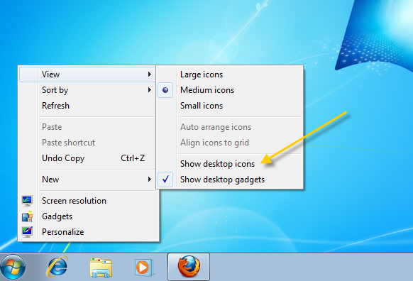
So I did a quick web search just out of curiosity and it turns out you've been able to permanently disable desktop icons since at least Windows XP! Meaning this has already been a feature of Windows for almost two decades at minimum and it's not even that hard to discover. In fact I'm pretty sure now I've stumbled upon this feature in the past but completely forgot about it because I just never needed it.
-
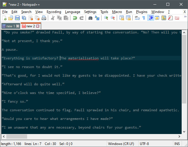
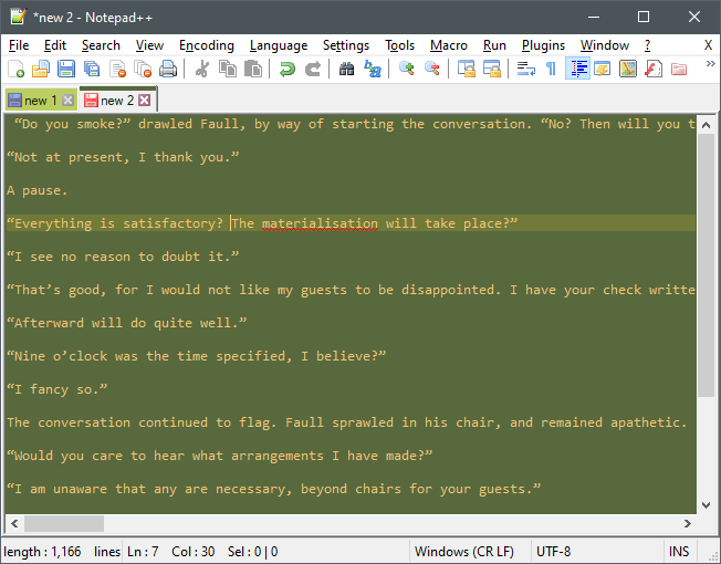
But default apps are not immune to data loss either so I don't understand the reasoning here. OneNote is the only Microsoft app I know of that will auto backup your files. Microsoft Office probably does too and I'm sure you know about the Open Office Writer recovery feature. Notepad++ actually has an automatic save/restore feature for new unsaved documents open in the program. Which means the chances of losing unsaved data are much lower than default notepad. It also means you can take quick temporary notes and not have to save them to file when closing the program. Every tab (saved and unsaved) will automatically be restored when you open it again. I love this feature and use it all the time. The problem is that the "nicest" themes are entirely subjective and I know from your video that what you think is nice I think is ugly ? so impossible to say. But here are just a few default themes: Edit: I just realized that by "theme" you may have thought I was also talking about the toolbar and overall look. These themes or styles are just for the text area, but you do have 3 options for toolbar icons in preferences. There may also be a plugin out there that let you do more. It's all open source so anything is possible.
-
The start menu is the alternative and was meant to basically replace the desktop starting in windows 8 with the ability to pin icons to it. Also, most all the programs I install make desktop shortcuts completely optional so it's never been an issue. I would suspect your issues are coming from installing tons of old shady programs. Speaking of which, you should really install all those in something like COMODO sandbox instead. This will not only protect your system from harm but also automatically prevent any icons from being created on your real desktop.
-
My suggested solutions are only to help you migrate to Windows 10 from your current setup today. However I'm probably mistaken about the built-in queued file transfer feature and mixing that up with the ability to pause. But like I said you can just keep using a third-party program and you're already using an explorer replacement with that feature anyway. Edit: It's also worth noting that large and/or complex file transfer operations are usually done using the command-line. And Windows actually has a built-in CLI tool (since Vista) called Robocopy that can apparently queue up transfers and more. So Windows 10 technically does have this feature but it's not the kind you're looking for.
-
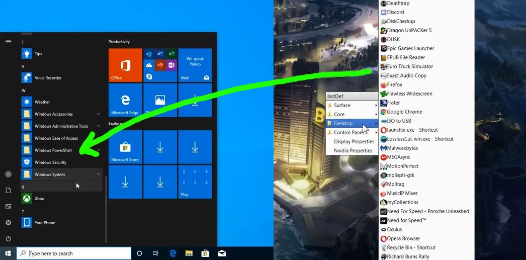
Desktop Shortcuts Dude, if you don't like them then just don't use them. Nobody is forcing you to use them. It is an optional feature after all, and many users actually use and like them. I thought removing user choice was your biggest issue? I guess it's just fine when it's something you personally don't like. Screw the millions of users that like desktop shortcuts. I don't like them so THOUGH SHALL NOT PLACE SHORTCUTS ON THE DESKTOP. ? Desktop shortcuts are also shortcuts placed literally on the desktop. Your version of "desktop" shortcuts is just a custom menu with a folder named "desktop" in it. Nothing is even organized in those menus anyway so what's the point? Just use the standard start menu with custom folders if you need them. Did you do all this just so you can click anywhere on the desktop to bring it up? That seems far worse than the default start menu because now you need to have some exposed desktop space to click on to open the menu. I'm sorry but this all seems pointless and counterproductive. Solution: Just use the start menu with custom folders instead. Main Shortcuts Solution: Just pin all your commonly used apps to the start menu. Managing Text Documents and Notes "Say I have 5 text files open". Whoa hold on there buddy! If you need that many open at once you should be using something better than word/notepad in the first place. I'd strongly recommend Notepad++. Don't let the name fool you though. This isn't just for coders. It's basically Notepad on steroids with complete customization options, themes, plugins and tab support. Very much like a web browser. You will never go back to default notepad ever again. If you take notes all the time then I'd recommend the free Microsoft app OneNote which let's you organize all your documents into sections and automatically backs them up to your OneDrive account. There is also the open source TiddlyWiki which is a note taking / personal wiki thing that I use all the time. It's actually just an HTML file so you can have it open as a tab directly in your browser next to all your webpages. Identifying and Switching Apps Quickly Solution: Use the alt+tab or win+tab hotkeys.

-
You seem to be talking about specific application guis here which is not at all what the video and discussion is about, so it's not really applicable, even though you can edit lots of types of media with the keyboard. You prefer a GUI (me too) and that's totally fine but the reason this whole CLI vs GUI debate happened was because you disputed the usefulness/efficiency of the keyboard. But just because you don't personally like using it doesn't mean it's objectively worse (quite the opposite in many cases actually). However, none of this matters if you don't want to use the keyboard. You keep saying people are welcome to prove you wrong but at the same time you seem quite paranoid of keyboard proponents and seem to view them as irrational zealots who want to take away your mouse. So I'm not sure you are as open-minded as you think you are. It might be a lot better if you just stated you're only interested in GUI solutions so nobody waste time suggesting things you'll never try.
-
NoahDVS never said CLI was better in all situations or that it was even superior to a GUI. I don't even use CLI that much but it is objectively faster/better in specific situations. Ironically, your rejection of CLI feels almost like religious fanaticism. One example that is not even CLI but purely keyboard based would be: [win] + "ca" + [return]. This is the command I use to bring up the calculator in less than half a second. All I have to type is "ca" and Windows search lists calculator as the top result (based on use history) and hitting return opens it. The only thing I can think of that would be almost as fast would be a mouse gesture, but that would require first creating one specifically for the calculator. However the ability to open almost any app I want in less than a second by pressing 4 keys makes the former technique far superior in flexibility and scope.