Jump to content

Edit History

V_R

V_R

Okay, Ross, you asked for it.


First of all, you should watch this video, it's exactly about bad UI. You'll feel shared frustation.
https://www.youtube.com/watch?v=dKx1wnXClcI
(Speaking of that guy, I'm sure, you'd like this video from him as well. It's about music and bad jobs, though.)
https://www.youtube.com/watch?v=AIxY_Y9TGWI


Here are my GUI solutions, but you probably will hate them. I'm currently on Windows 7 too, so I am not sure, how future-proof my workarounds are. Too. But I don't rely on external software so much.


I'll start with minor things, retreading points from your video, and at the end will drop a major reveal.


So, as for look of the GUI, I'm fine with windows 1998 themed look. It has a feel of physical object, and you can distinguish "interface" part from "actual content" part, it's not "everything is snow-white" modern style where everything blurs together.
As for instant tooltips over taskbar. I use standart windows taskbar, and tooltips pop out pretty fast. I suppose that for that you need to turn off every animation that windows keeps turned on by default. Stuff like smooth scrolling and other "eye candy". Less animations — more free time. Classic theme turns off many unnecessary animations by default, but not all of them.
Though, some experimentation showed that in order for tooltip to occur you need to stop moving your cursor over an icon. So, it requires a bit of precision.

Also, as I noticed, you need those tooltips mainly to manage different text files. When I work with texts, I use Notepad++ (mainly because of hatred towards Word interface and other crap that Word pulls off), and Notepad++ has great support of tabs. Like, you don't have this problem with browser windows, right? Because all Internet tabs are in one Firefox window? You can do the same with text files. Also, speaking of browser, do you really need to open in so often? I open it on the system startup and rarely close it.


Double clicks: you can turn them to just clicks via vanilla Windows means. Open "folder parameters" or something like it in control panel and there it is. (Sorry for imprecise terms, my Windows is in another language, so it's backwards translated.)


Mouse gestures are annoying, IMO, and hotkey combinations are basically the same thing, but much less prone to misclicks and mistakes. There are plenty of combinations that you can do with left hand. Same goes for "precision" argument — there are hotkeys for actions that require precision. Like, do you really close windows by X? Just alt-f4 them.


Now it is time for promised reveal. YOU DON'T NEED DESKTOP AT ALL. Okay, hear me out. It's empty, purposeless space, waste of pixels on nothing. Basically, it's what you see when you don't work in any software, and you better be spending every moment on movie or something. It's just a place for icons, and some light file management, and there are better ways to do file management and to launch programs.


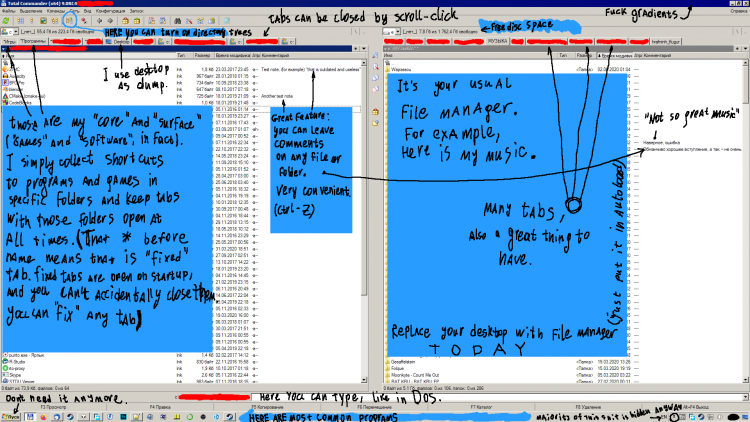
So, what do I do? I put Total Commander in autoload, and it is my "desktop", "default" thing that I look at. I alt-tab between it and other windows, and don't have a need to look at desktop at all. Not only Total Commander is highly customizable file manager with some features that I now find essential and life-saving, but you definitely can use it to launch software and games. For more information, look at the attached picture of my "workspace". BTW, Total Commander is not some obsolete piece of software, it is supported and it works in windows 10.


(It's not advertisment, if you find Total Commander expensive, well, you know what to do.)
https://www.ghisler.com/screenshots/en/01.html


Yeah, you lose beautiful wallpapers, but you can watch them on second monitor. And you probably need second monitor anyway.
Интерфейс.png

V_R

V_R

Okay, Ross, you asked for it.

First of all, you should watch this video, it's exactly about bad UI. You'll feel shared frustation.
https://www.youtube.com/watch?v=dKx1wnXClcI
(Speaking of that guy, I'm sure, you'd like this video from him as well. It's about music and bad jobs, though.)
https://www.youtube.com/watch?v=AIxY_Y9TGWI

Here are my GUI solutions, but you probably will hate them. I'm currently on Windows 7 too, so I am not sure, how future-proof my workarounds are. Too. But I don't rely on external software so much.

I'll start with minor things, retreading points from your video, and at the end will drop a major reveal.

So, as for look of the GUI, I'm fine with windows 1998 themed look. It has a feel of physical object, and you can distinguish "interface" part from "actual content" part, it's not "everything is snow-white" modern style where everything blurs together.
As for instant tooltips over taskbar. I use standart windows taskbar, and tooltips pop out pretty fast. I suppose that for that you need to turn off every animation that windows keeps turned on by default. Stuff like smooth scrolling and other "eye candy". Less animations — more free time. Classic theme turns off many unnecessary animations by default, but not all of them.
Though, some experimentation showed that in order for tooltip to occur you need to stop moving your cursor over an icon. So, it requires a bit of precision.
Also, as I noticed, you need those tooltips mainly to manage different text files. When I work with texts, I use Notepad++ (mainly because of hatred towards Word interface and other crap that Word pulls off), and Notepad++ has great support of tabs. Like, you don't have this problem with browser windows, right? Because all Internet tabs are in one Firefox window? You can do the same with text files. Also, speaking of browser, do you really need to open in so often? I open it on the system startup and rarely close it.
Double clicks: you can turn them to just clicks via vanilla Windows means. Open "folder parameters" or something like it in control panel and there it is. (Sorry for imprecise terms, my Windows is in another language, so it's backwards translated.)
Mouse gestures are annoying, IMO, and hotkey combinations are basically the same thing, but much less prone to misclicks and mistakes. There are plenty of combinations that you can do with left hand. Same goes for "precision" argument — there are hotkeys for actions that require precision. Like, do you really close windows by X? Just alt-f4 them.

Now it is time for promised reveal. YOU DON'T NEED DESKTOP AT ALL. Okay, hear me out. It's empty, purposeless space, waste of pixels on nothing. Basically, it's what you see when you don't work in any software, and you better be spending every moment on movie or something. It's just a place for icons, and some light file management, and there are better ways to do file management and to launch programs.
So, what do I do? I put Total Commander in autoload, and it is my "desktop", "default" thing that I look at. I alt-tab between it and other windows, and don't have a need to look at desktop at all. Not only Total Commander is highly customizable file manager with some features that I now find essential and life-saving, but you definitely can use it to launch software and games. For more information, look at the attached picture of my "workspace". BTW, Total Commander is not some obsolete piece of software, it is supported and it works in windows 10.

(It's not advertisment, if you find Total Commander expensive, well, you know what to do.)
https://www.ghisler.com/screenshots/en/01.html

Yeah, you lose beautiful wallpapers, but you can watch them on second monitor. And you probably need second monitor anyway.

Интерфейс.png

×
×
  • Create New...

This website uses cookies, as do most websites since the 90s. By using this site, you consent to cookies. We have to say this or we get in trouble. Learn more.