On the Linux front, a lot of things that Ross said he wants in the video is already provided by the KDE Plasma desktop environment, it is ridiculously customizable, it's possible to change almost every thing about it and there's tons of widgets and plugins that can add more functionality. It's the one I use, so I may be a little biased, but I think it's a good starting point.
There are whole communities of linux users dedicated to creating a nice-looking efficient desktop, such as /r/unixporn and /r/usabilityporn on reddit. Unixporn has been almost completely dominated by minimal window managers, which take a LOT of work to configure (and you must do it via huge configuration files) and is almost completely shortcut-based. I've seen people using this sort of stuff and it's crazy how fast it can be when you get used to it.
Both GNOME and Plasma have what it's called a "dashboard" that can be used instead of a default menu, which it have large icons of favorite and recently used application as well as a search bar. Also, they have "categories" directories to separate your programs, like "Games" and "Office" and most programs will be placed in the appropriate category when installed.
Regarding command lines, the primary advantage is that you can launch a program with tons of starting parameters and you can get pretty informative error messages on most software. Other than that... a lot has to do with workflow, if I can do a lot of stuff in different terminal tabs or split views, I only need the keyboard. You can also write short scripts directly in the command line, without having to open an editor, you just type it down and press enter. It's fantastic for automating little stuff, it save a lot of time.
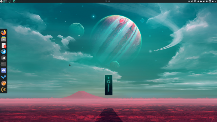
This is how my desktop currently looks like (KDE Plasma 5.19). On the left corner of the top panel you have, in order, the dashboard icon, the virtual desktops widget (the rectangles) and CPU and RAM usage (the circles). On the right is the system tray. The dock (Latte Dock) is extremely configurable, including delays for hovering and whatnot (I currently have it to show all open instances of the same program on a left click). I also have a drop-down terminal, like in quake for quick access. I use one of the really dark themes, but one with good contrast. I usually try out new colorschemes, themes and icons every few weeks but I've always come back to this configuration.


